PART 4 OF 5
Let us help you with your financial website makeover.
In Part 4 of our 5 part series we’ll uncover solutions for getting your financial brand and financial website noticed and how you can leverage visual design to make a memorable impact.
Feel free to review previous posts in this series:
- Part I of this series looked at the challenges and opportunities with improving the Focus, Flow and Continuity on your website. Click here to start with that post.
- Part II dealt with your website’s Purpose and Depth. Click here to read it.
- Part III (although a little long) covered the important issues of getting your prospects to take action and positioning your uniqueness. Click here to read it. Click here to read it.
VISIBILITY
CHALLENGE:
A successful financial website can fulfill a simple role such as impressing people that were referred to you and motivating them to take next step. Even if that was its only role and your website did that well, you’d have a high return on your investment. If you’re not receiving as many referrals as you’d like, a really good website will help.
A successful financial website can also be one that attracts ideal prospects to your website and influences them to the point where they contact you. This initial attraction strategy can be achieved via search engine optimization, social networking, public relations, direct advertising, online ads, print ads, media ads, email campaigns and personal introductions. Remember, there’s no point in having traffic if your site doesn’t cut it.
SOLUTION:
The best tactics for increasing visibility are having great content (papers, posts, checklists, etc), getting your content online (website, blog, content hubs), and then sharing via your social networks. Public relations would be a good add-on here too.
Let’s assume you already have great content, a fabulous looking website and a clear advisor brand. In order to increase your brand and website visibility, you need to get your message out there. The goal here is to get more ideal eyeballs to your website and social networks. This will increase engagement (downloads), expand your network (social connections) and help generate more leads (captured name and email) and opportunities (people open to exploring your services).
| TACTICS |
TOOLS |
GOALS |
| Track and measure everything you can. |
Google Analytics, |
See what works and how well. |
| Post to your blog weekly. Make your blog its own entity or add it to your company website. |
Blog (WordPress or Joomla) | Get’s your expertise out there. Often hub of marketing. |
| Media Ads |
Facebook Ads, LinkedIn Ads, Google Ads, Re-Targeting Ads |
Increase exposure |
| Get published with valuable content/insight. |
Public Relations |
Increase visibility and credibility with published content or expertise quotes |
| Viral Video |
YouTube |
Increase emotional engagement, and brad awareness |
| Social Networking |
Facebook, LinkedIn, Google+, Twitter |
Expand network and increase opportuniti4s to influence. |
| Update social profiles at least 3 days per week and on numerous occasions on those days. |
Hootsuite, Updates on each profile, SproutSocial, Buffer |
Make sure your content gets read. Promotes new connections, expands influence. |
| Website linking | Your team |
Get linkbacks and increase brand exposure |
VISUALS
CHALLENGE:
As mentioned in Part III, showing how you are different and/or better is critical to having marketing success. We mention this again because there’s a specific “how we do it” that needs to be addressed. People like visual representations of processes (financial planning for instance), it promotes confidence; it says, “we’ve done this before”. It also helps people understand what is being done so they feel informed. Lastly, when you make the “how” visual, it really helps people connect with it.
SOLUTION:
I highly recommend using visuals (diagrams, videos, infographics) to describe how and what you do.
It’s very common for financial professionals to express their “process” in simple (and boring) terms. This isn’t the worst thing, provided you relate it back to your strengths and your ideal audiences needs.
Most advisors use something like this:
- discover
- analyze
- recommend
- implement
- monitor
There’s inherent credibility in sharing this simple process as a visual yet it does beg for a more.
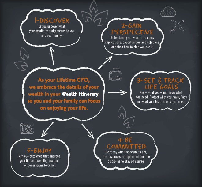
Here’s a real world example. We took something similar for a client in California, Wealth Design, and did the following. Since their audience is younger affluent families in the Silicon Valley we went for a more modern and fun approach – chalkboard with lots of contrast. We also incorporated concepts that would speak to this generation such as an Itinerary versus a Plan. We also considered that this audience connects better with “what’s in it for me – and my family”. Please do NOT copy this one, create your own financial website ideas!


